How to Build Interactive and User-Friendly Power BI Dashboards

1. Understand Your Objectives
It is important to identify what the goal of the Power BI dashboard is before proceeding with its creation. Determine what the users require and how they would engage with the data. Clear goals are important to stay on track and remain relevant to required business needs and to guarantee that the dashboard provides valuable data in the corresponding areas.
For instance, the sales department may wish to have a Power BI dashboard that generates information on regional performance, conversion rates, and sales expectations. On the other hand, an HR team may need Power BI dashboards that display the rates of turnover, recruitment, and scores of employees’ engagement. Specifying these use cases in the dashboard makes the work relevant and clear by adapting the design and contents of the tool.
2. Focus on User-Centric Design
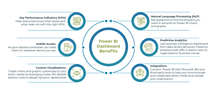
When designing layouts, prioritize clarity and ensure they are intuitive to navigate. Do not use unnecessary data in a single go but use enough to provide logical data flows to the average user. Put vital KPIs at the top of the page, starting with the header row, so they are easily seen. Link related metrics reasonably to enhance the understanding.
Furthermore, to draw attention to trends, potential dangers, or achievement goals, it may be helpful to employ color coding. The use of fonts and colors should be rightly applied to provide a sense of continuity and also to improve the readability of the material. The opportunities, like slicers & filters, make data exploration more compelling as users can directly navigate toward certain data types or categories. These tools are most helpful whenever designing a wide range of Power BI dashboards to be used by a broad clientele with markedly different demands for information.
3. Select Appropriate Data Visualizations
Selecting the right graphical representation of data is crucial in developing an effective dashboard. All visualization types have their strengths and weaknesses; therefore, choose the appropriate type based on the message being conveyed.
For trend analysis, a line chart is used because this shows the data points across the time factor. The bar chart is well suited to making categorical comparisons, while the pie chart can be used to show percentage distributions, although the authors caution against the use of the pie chart because it tends to clutter quickly. When a user requires specific data, rather than wanting to identify patterns and trends, then tables should be used. Make sure that visuals are not only attractive but also comprehensive.
4. Optimize Data Model Performance
The basic premise of a Power BI dashboard is that it is only as effective as the data model that supports it. Data modeling forms an essential category as it facilitates fast loading times, effective interaction, and accurate calculations. Data relationships, choosing the right kind of data model for Power BI and getting rid of duplicate data are some of the most significant steps in this process. Applying calculated columns and measures should be kept to a minimum.
Whenever you can, perform all complicated operations with data in Power Query before you import a table to Power BI. This approach reduces the expenses of resources and makes the dashboards as interactive as possible.
5. Leverage Interactivity Features
Another feature that makes Power BI unique from other reporting tools is its interactivity. Implement slicers, filters, and drill-through options to allow users to interact with the data being presented. These features assist the users in having a breakdown of certain areas or elements of the data without having to obtain other reports.
Bookmarks are also helpful because you can add several versions of a dashboard and switch between them without any issues. This feature becomes most beneficial when a single dashboard must be shared with different business arms or departments. In addition, buttons help with navigation through the dashboard, and tooltips clarify the parts of the visual without overtaking the space. These dynamic interactions make it fairly easy to provide the user with a rich environment for interacting with the data.
6. Ensure Data Accuracy and Security
Having data that is accurate is critical in creating trust in Power BI dashboards. Make certain that the sources of data are reliable, up-to-date, and correctly imported into Microsoft Power BI. Perform some analyses and tests to ensure that every metric and KPI is computed accurately and displayed appropriately. Data also needs to be protected with as much vigor as this information since it contains essential business information.
Power BI enables organization administrators to control the users’ access to different datasets and reports in a more refined way by deploying role-based access control. Due to proper management of permissions, the various users will only be allowed to access respective data that is about their duties, while the other confidential information will be protected.
7. Test and Iterate
Creating a Power BI dashboard is not just a one-time task that can be easily completed. It is also crucial to design the dashboard to allow for regular updates and modifications, ensuring it continues to meet user requirements and functions effectively. Use a set of specific users to try out the dashboard before it is deployed and gather data regarding its usability, readability, and effectiveness. Track and analyze how users engage with the product upon deployment to discover opportunities for optimization.
Other common problems, like slow loading time, can be solved by fixing the data model or reducing the complexity of graphics works. Also, try to consider if you need to schedule your updates for the newer data feeds or vital business stats that change over time.
8. Keep Power BI Dashboards Simple and Intuitive
Ease and versatility are some of the factors to consider when constructing a Power BI dashboard. Most users appreciate clear organization, which allows them to quickly and painlessly analyze the information without clutter and confusion.
Do not overload the presentation with charts and visuals, as it makes the material look cluttered. Ensuring that the components are evenly spread across the planner can help create balance and enhance the apparent readability of the dashboard. Arranging similar information in coherent sections helps avoid abrupt changes and lets users easily familiarize themselves with the data provided easily.
9. Make Use of Power BI’s Advanced Features
Power BI offers advanced features that enhance dashboards, making them highly effective for extended data analysis. Integrating machine learning models allows for predictive analytics, enabling users to forecast future trends and occurrences with greater accuracy.
Besides, custom visuals are highly versatile, which means that every company can create one-of-a-kind charts and graphs for their specific niches. Also, insights derived from AI are designed to calculate instant key performance indicators and trends. Using these improvements makes the existing features of the product more valuable and effectively brings the idea of creating Power BI dashboards to the level of business analytics tools.
Conclusion
Creating engaging and visually appealing Power BI dashboards depends on the concepts of design, data architecture, and general programming. By setting clear goals, emphasizing the user experience, selecting the right type of visualization, and using Power BI’s interactivity, enterprises can build high-impact dashboards to support their activities. Regardless of whether you are experimenting with Power BI for the first time or seeking to improve your current Power BI dashboards, these practices will lead you to the right way.
Whether your organization has a deep understanding of Power BI’s capabilities or just a general idea of its potential to elevate business intelligence, partnering with Code Creators will help you unlock new levels of success. As a trusted Power BI Consultant, we offer expert Power BI consulting tailored to meet your unique needs and deliver the best solutions for your organization.
Author

Sherry Rajani, is a tie-loathing adventurer and troublemaker who believes in turning ideas into reality. Even though his experience is primarily in Microsoft Cloud and On-Premise Solutions, Sherry has also lead teams building Custom ERPs, Mobile Applications, Data Management and other solutions.
After working in the Toronto Technology Industry for a while, Sherry started his own Technology Consulting Firm, Code Creators Inc., specializing in the Office 365 Stack ranging from SharePoint Online, the Power Platform, PowerBI and Microsoft Teams.