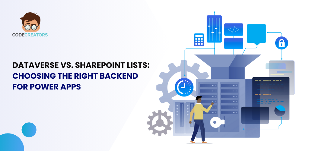
SharePoint Flexible Sections: How to Resize, Overlap, and Move Web Parts
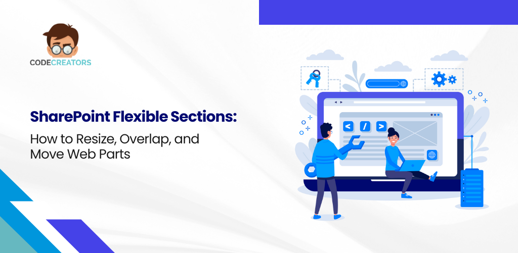
What if SharePoint page design could go beyond static zones and structured grids? With the introduction of Flexible Sections, that vision is now a reality. SharePoint has taken a bold leap into the future of web design, enabling dynamic resizing, overlapping elements, and drag‑and‑drop web part placement—giving users unmatched control over layout and creativity.
In the January/February 2025 issue of Hands-On SharePoint and Simply SharePoint, Microsoft’s design update to modern SharePoint pages was celebrated as one of the most awaited enhancements for content creators and intranet developers alike. Let’s explore how Flexible Sections empower your design process, why they matter, and how you can use them today.
The Evolution of Page Layouts in SharePoint
Before Flexible Sections, SharePoint pages followed a structured, grid-based layout. You could select predefined section templates—single column, two columns, one-third left, etc.—and then insert web parts into locked containers. While these layouts ensured consistency, they limited creativity and design freedom.
With Flexible Sections, SharePoint breaks free from these constraints. Now, you can:
- Resize web parts in any direction.
- Overlap content blocks to create layered visuals.
- Drag and drop sections anywhere on the page.
This shift transforms SharePoint from a rigid content platform into a true design canvas.
What Are Flexible Sections?
Flexible Sections are an enhancement to the SharePoint modern page editing experience. Instead of using fixed layouts, these sections allow you to position, layer, and size elements freely—just like a graphic design tool. Each section becomes a freeform container, supporting:
- Drag-and-drop placement of any web part.
- Adjustable width and height beyond column restrictions.
- Element overlapping for multimedia, text, or widgets.
- Custom Z-index settings to control which item appears on top.
These capabilities mimic the flexibility you’d find in design tools like Figma or Canva—within SharePoint’s web part environment.
Key Features That Redefine Page Design
Let’s break down the top features introduced with Flexible Sections:
1. Dynamic Resizing for Any Element
Flexible Sections support vertical and horizontal resizing. Web parts no longer need to sit inside fixed-width containers. You can stretch an image across the screen or shrink a calendar widget to fit a small sidebar—giving you precise control over dimensions.
2. Freeform Drag-and-Drop Placement
Gone are the days of snapping content into predefined zones. With drag-and-drop functionality, you can freely move web parts around the canvas. This allows fluid rearrangement without deleting or recreating elements.
3. Overlapping Web Parts for Layered Designs
Want to place text over a background image? Or stack multiple visuals for a parallax effect? Overlapping is now fully supported. You can layer content just like in a design application, offering depth and visual interest to your layouts.
4. Custom Spacing and Margins
Each element in a Flexible Section can be styled with individual padding, margins, and alignment settings. This allows clean spacing and precise design control, even when working with multiple overlapping elements.
5. Section Background Customization
Flexible Sections support section-wide background images and colors, making it easy to create themed blocks, promotional banners, or branded headers—all without custom code.
6. Mobile Responsiveness Built-In
Despite all this freedom, SharePoint ensures that Flexible Sections maintain responsive behavior. Whether your users view the site on desktop, tablet, or mobile, elements auto-adjust to screen size while preserving layout integrity.
Benefits for Intranet Designers and Content Creators
The impact of Flexible Sections goes beyond aesthetics – it’s about improving usability, engagement, and speed of content delivery.
Empowering Non-Designers to Build Beautiful Pages
You no longer need coding skills or complex web design tools. Flexible Sections democratize design by letting non-technical users build beautiful, responsive pages through simple clicks and drags.
Faster Content Creation and Updates
Need to update your homepage for an internal campaign? With drag-and-drop freedom and resizable blocks, content can be adjusted in minutes, not hours.
Improved Engagement Through Visual Storytelling
Design is no longer linear. With overlapping elements and dynamic layouts, pages feel more like storyboards—capturing attention and guiding users through content naturally.
No Need for Third-Party Page Builders
Many organizations previously relied on third-party tools or SPFx-based solutions to achieve custom layouts. Flexible Sections eliminate that need, allowing you to stay within the SharePoint ecosystem.
Use Cases for Flexible Sections in Modern SharePoint
Here’s how Flexible Sections shine in real-world scenarios:
- Corporate Intranet Homepages
Layer images, announcements, and KPIs in an engaging hero layout. - Event Landing Pages
Stack countdown timers, speaker bios, and session overviews in custom arrangements. - Team Dashboards
Resize and align task lists, calendars, and performance charts with optimal balance. - Knowledge Hubs
Use overlapping labels and expandable boxes for categorized content display. - Brand Portals
Highlight visual elements like logos, product displays, and marketing videos—all in one scrollable experience.
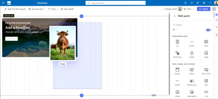
How to Enable and Use Flexible Sections
To start using Flexible Sections:
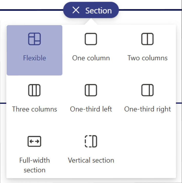
- Create or edit a modern page in your SharePoint site.
- Select “Add a new section” and choose the “Flexible” layout option.
- Add web parts to the section as needed.
- Use the resize handles and position controls to place each element precisely.
- Set background colors or images to define section themes.
- Preview on mobile using the device simulator to ensure responsiveness.
No additional plugins are required—this is a native SharePoint experience, included in recent updates as of early 2025.
Best Practices for Designing with Flexible Sections
To make the most of these new capabilities, follow these design tips:
- Start with a Wireframe
Map out your layout on paper or a tool like Miro before dragging elements. - Use Layers Wisely
Overlapping is powerful—but don’t overdo it. Make sure content remains scannable and accessible. - Test on Multiple Devices
Ensure that resizing and overlapping still render well on tablets and smartphones. - Stay Brand-Aligned
Use section backgrounds and layouts that reflect your corporate identity. - Use Templates
Save time by creating and reusing flexible section templates for newsletters, campaigns, or project sites.
Final Thoughts: A New Era of SharePoint Design
With Flexible Sections, Microsoft has bridged the gap between structured content management and modern web design. This update is a game-changer for organizations that want their SharePoint sites to feel dynamic, modern, and brand-aligned—without custom code.
Designers, content creators, and intranet managers now have full freedom to tell stories visually, build intuitive pages, and adapt quickly to business needs. Whether you’re creating an executive dashboard or a creative hub for marketing, Flexible Sections open up new possibilities for what SharePoint can become.
If you want to reshape your pages with this newfound design power, then connect with Code Creators Inc. today to unleash the hidden power of your SharePoint.
At Code Creators, we help organizations create smarter, more engaging digital workplaces by blending cutting-edge design with strategic expertise. Whether you need a skilled Power BI consultant to transform complex data into actionable insights or trusted SharePoint consulting services to optimize collaboration and content management, our team delivers solutions that drive measurable results. Let us help you harness Microsoft’s most powerful tools to achieve your business goals.
Author

As the CTO at Code Creators, I drive technological innovation, spearhead strategic planning, and lead teams to create cutting-edge, customized solutions that empower clients and elevate business performance.